| Parents | Children | Properties | Methods | Events |
| Purpose: | The ListView object displays a collection of items. |
Description
The ListView object is a window that displays a collection of items, each item consisting of an icon and a label. The ListView provides several ways of arranging items and displaying individual items. For example, additional information about each item can be displayed in columns to the right of the icon and label. An example of the use of a ListView object is the "My Computer" Windows utility.
The Items property is a vector of character vectors that specifies the labels for the items displayed by the ListView. The ImageListObj property specifies the names of two ImageList objects that define two sets of icons; a large icon (32x32 pixel) set and a small icon (16x16 pixel) set. Alternatively, ImageListObj may be empty (no icons displayed) or contain just the name of a single large icon ImageList.
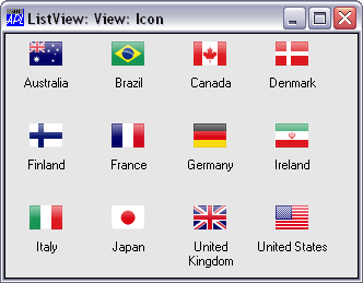
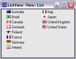
The View property contains a character vector that determines how the items are displayed. It may have one of the following values; 'Icon' (the default), 'SmallIcon', 'List' or 'Report'. When View is 'Icon' or 'SmallIcon', the items are arranged row-wise with large or small icons as appropriate. When View is set to 'List', the items are arranged column-wise using small icons. Examples of 'Icon' and 'List' views are illustrated below.
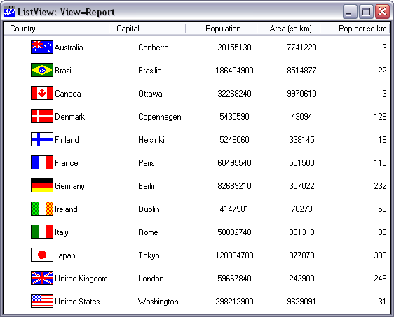
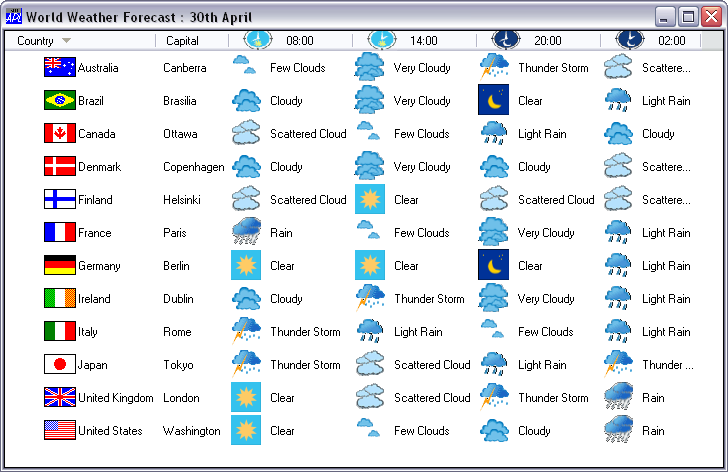
When View is set to 'Report', the items are displayed in a single column using small icons but with the matrix specified by ReportInfo displayed alongside. In this format, the Boolean Header property determines whether or not the object also provides column headings. Its default value is 1. The column headings themselves are specified by the ColTitles property. Their alignment (and the alignment of the data in the columns beneath them) is defined by the ColTitleAlign property.
The appearance of the column titles is further controlled by the ColTitle3D property. This is a Boolean value (default 1) which specifies whether or not the column titles have a 3-dimensional (plinth) appearance. Header and ColTitle3D may only be set when the object is created using ⎕WC and may not subsequently be changed by ⎕WS.
In 'Report' View, columns may be resized by the user dragging the bars between the titles, or under program control using the SetColSize event. A 'Report' view example is illustrated below.
The DragItems property is Boolean and specifies whether or not the user may drag an item from one position to another. Its default value is 1 (dragging is enabled).
The AutoArrange property is Boolean and specifies whether or not the items are automatically re-arranged whenever an item is repositioned by the user or moved under program control. Its default value is 0.
The EditLabels is a Boolean property (default 0) that determines whether or not the user may edit the labels which are specified by the Items property.
The Style property may be 'Single', which specifies that only one item may be selected at a time, or 'Multi' which permits multiple selections to be made. The default is 'Multi'.
The CheckBoxes property is Boolean and specifies whether or not check boxes are drawn to the left of items. Its default value is 0.
The GridLines property is Boolean and specifies whether or not grid lines are drawn between items. This applies only when View is 'Report'. Its default value is 0.
In 'Report' View, the ReportImageIndex property specify images to be displayed alongside each item, and overrides the images specified by ImageListObj. The HeaderImageList and HeaderImageIndex properties specify images to be displayed alongside each column title.
The following example illustrates the use of these properties.
The ReportBCol property specifies each item's background colour.
The FullRowSelect property is Boolean and specifies whether or not the entire row is highlighted to indicate selected items. This applies only when View is 'Report'. Its default value is 0.
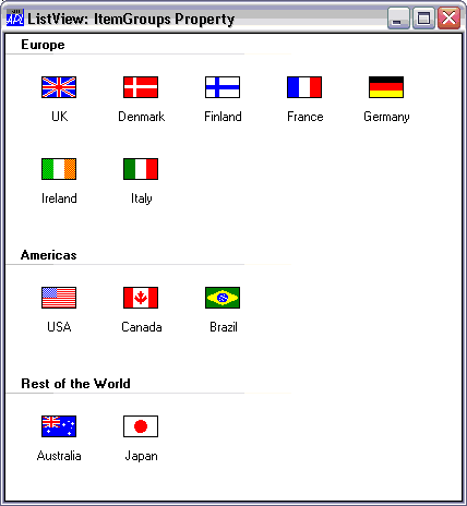
The ItemGroups and ItemGroupMetrics properties allow you to display items in groups as illustrated below.
Note that this feature only applies if Native Look and Feel is enabled.