| Parents | Children | Properties | Methods | Events |
| Purpose: | The ToolButton object represents a button in a ToolControl. |
Description
The ToolButton object represents a selectable button in a ToolControl object.
A ToolButton displays a text string, defined by its Caption property, and an image defined by its ImageIndex property. Apart from these characteristics, the appearance of a ToolButton is controlled by its parent ToolControl object.
ImageIndex is an index into an ImageList which contains a set of icons or bitmaps. The ImageList itself is named by the ImageListObj property of the parent ToolControl.
Typically, you will create up to three ImageLists as children of the ToolControl. These will be used to specify the pictures of the ToolButton objects in their normal, highlighted (sometimes termed hot) and inactive states respectively. The set of images in each ImageList is then defined by creating unnamed Bitmap or Icon objects as children. Finally, when you create each ToolButton you specify ImageIndex, selecting the three pictures which represent the three possible states of the button.
If you specify only a single ImageList, the picture on the ToolButton will be the same in all three states.
The behaviour and appearance of a ToolButton is further defined by its Style property, which may be 'Push', 'Check', 'Radio', 'Separator' or 'DropDown'.
Push buttons are used to generate actions and pop in and out when clicked. Radio and Check buttons are used to select options and have two states, normal (out) and selected (in). Their State property is 0 when the button is in its normal (unselected state) or 1 when it is selected.
A group of adjacent ToolButtons with Style 'Radio' defines a set in which only one of the ToolButtons may be selected at any one time. The act of selecting one will automatically deselect any other. Note that a group of Radio buttons must be separated from Check buttons or other groups of Radio buttons by ToolButtons of another Style.
A ToolButton with Style 'Separator 'has no Caption or picture, but appears as a vertical line and is used to separate groups of buttons.
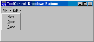
A ToolButton with Style 'DropDown' has an associated popup Menu object which is named by its Popup property. There are two cases to consider.
If the ShowDropDown property of the parent ToolControl is 0, clicking the ToolButton causes the popup menu to appear. In this case, the ToolButton itself does not itself generate a Select event; you must rely on the user selecting a MenuItem to specify a particular action.
If the ShowDropDown property of the parent ToolControl is 1, clicking the dropdown button causes the popup menu to appear; clicking the ToolButton itself generates a Select event, but does not display the popup menu.
The following example illustrates the use of DropDown buttons:
'F'⎕WC'Form' 'ToolControl: Dropdown Buttons'('Size' 20 40)
'F.TB'⎕WC'ToolControl'('ShowDropDown' 1)

:With 'F.FMENU'⎕WC'Menu' ⍝ Popup File menu
    'NEW'⎕WC'MenuItem' '&New'
    'OPEN'⎕WC'MenuItem' '&Open'
    'CLOSE'⎕WC'MenuItem' '&Close'
:EndWith

:With 'F.EMENU'⎕WC'Menu' ⍝ Popup File menu
    'CUT'⎕WC'MenuItem' 'Cu&t'
    'COPY'⎕WC'MenuItem' '&Copy'
    'PASTE'⎕WC'MenuItem' '&Paste'
:EndWith

'F.TB.B1'⎕WC'ToolButton' 'File'('Style' 'DropDown')('Popup' 'F.FMENU')
'F.TB.B2'⎕WC'ToolButton' 'Edit'('Style' 'DropDown')('Popup' 'F.EMENU')
